Make it easy for your mobile users
Filling out a form online can be quite annoying. Filling one out on your mobile device can be even worse. What is truly the worst experience is when the website that requires this form to be filled out has no mobile usability. What you can get away with on desktop becomes excruciating to plod through when your customers have to use your desktop form on a mobile device.
In a previous article I talked about why your landing pages need to be responsive and I explained how it is important to cater to your users regardless of the device they are using. This post is to inform you that just making something look nice on mobile isn’t all that is needed. Having a landing page that caters to the small amount of space and features that the phone has is very important. All too many times I have tried to fill out a zip code field while the default keyboard is being displayed. Trying to enter in my phone number with a a-z keyboard is not the most ideal either.
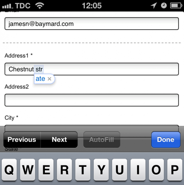
The Baymard Institute recently did a usability study on mobile commerce sites and the issues of not fully optimizing their form fields for touch keyboards. The guide they provided can be quite useful for the landing pages designed for your dating landing pages. Some key features to take advantage of are:
- Make good use of the autocapitalize=”off” autocorrect=”off” for fields that might be unique and can’t have capitalized letters. These include the username and email fields
- Make good use of the “type” field. This will allow you to show the correct keyboard for the field you are using. If the field is all numbers use the “tel” type for telephone.
- Don’t split the phone number field or use inline labels as they both make things harder on your users
The less time your visitors spend filling out the forms on your landing pages the more likely they will complete the form and create a profile.
*All information provided by the Baymard Institute’s usability study